


Creating Brand Advocacy
A Talkable Brand Starts with a Great Foundation
Heights Wellness Retreats

formerly Massage Heights
A brand rediscovering its purpose creating a new place in the wellness landscape.
Massage Heights was a successful national franchise with over 100 units open in the U.S. and Canada, but over time the brand started to become stale. Competitors modernized but all the services remained the same. The world around it evolved and the category was not changing fast enough. The next generation of consumers want holistic wellness, not just a massages or facials. And the personal-care category exploded into dozens of new modalities that reshaped expectations.
The founder had a vision for where she wanted to take the brand, however she didn’t understand the right path to get there. The brand needed more than a new logo or a new tagline; it needed to find its future.
That’s where we began.
GDJ Brands was brought in to think through everything from the ground up: purpose, audience, value, identity, services, language, and culture. Through deep consumer-centric insight work, brand anthropology, and a reexamination of human motivators, the truth became clear: consumers were no longer seeking relaxation; they were seeking strength of Mind, Body, Energy, Confidence, Recovery, and Renewal.
The brand wasn’t “Massage Heights” anymore. The name pigeonholed the brand, stifling its growth. It had outgrown the name. So we rebuilt it; intentionally, intelligently, boldly, and holistically.
Heights Wellness Retreats was born. A place for unstoppable people to recharge, rebalance, and rebuild their inner force. A place rooted in a more expansive value proposition that integrates therapeutic massage, guided recovery, mental well-being, lymphatic care, red light/infrared therapy, halotherapy, cold therapy, and more. We added services as reimagined the environment to create surprise and delight. Services and environmental elements that customers would find remarkable but more importantly; advocate.
From brand strategy to service architecture… from consumer journeys to the “Rise & Recharge Room”… from values to visual identity… the brand was rebuilt with one outcome in mind: create a Remarkable Wellness brand that does remarkable things in remarkable ways. Because we know that Remarkable Brands generate word of mouth advocacy, not just loyalty.
Today, Heights Wellness Retreats is positioned not as a relaxing massage chain, but as a holistic wellness platform for the everyday achiever. A brand that creates stronger advocacy, elevates unit economics, and can innovate as people evolve.
The REP’M Group
Building a franchise development powerhouse from zero; engineered to dethrone the category leader and even recreate the category.
When the founders of what would become The REP’M Group approached the franchising world, the space was dominated by one clear powerhouse: St. Gregory Development Group. For years, St. Gregory set the standard as the most recognized, the most proven, the most talked-about franchise development company in the country.
So the task wasn’t to simply “create another development company.”
The task was to build a brand capable of replacing the category leader and ultimately outperforming it.
That required more than marketing. It required creation.
GDJ Brands was brought in at the very inception; before the name, before the model, before the business had a heartbeat. From a blank page, we architected the entire foundation: the strategy, the brand, the identity, the structure, the model, the narrative, and the long-term competitive position. The REP’M Group would not be built to compete. It would be built to surpass.
We performed a full tear-down of the franchise development category: strengths, gaps, inefficiencies, blind spots, client frustrations, and system failures. The insight was unmistakable: founders needed a partner that delivered clarity, transparency, structure, and cross-functional execution under one unified system. Founders needed 360 degree confidence from one expert engine.
From that insight, The REP’M Group was engineered.
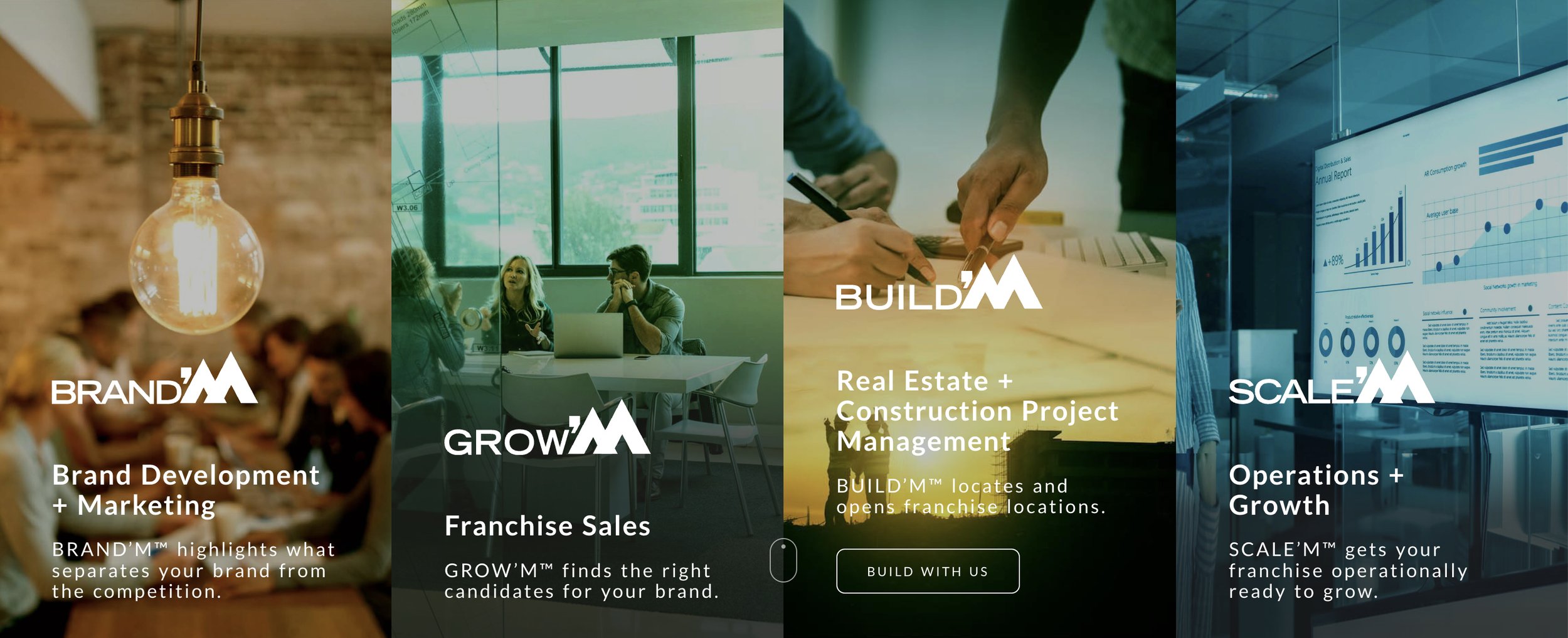
We designed the brand around a four-part operating system - BUILD’M, BRAND’M, GROW’M, SCALE’M - a modular but unified model that gave emerging franchisors everything St. Gregory offered, plus everything it didn’t: deeper strategy, tighter integration, stronger brand stewardship, and a more founder-centric philosophy. Allowing founders to “Scale with Confidence.”
We created the name. The identity. The positioning. The voice. The narrative architecture. The visual system. The client franchising strategies. And the cultural ethos.
Every component was designed with a single mandate: set a new standard in franchise development.
And it worked.
The REP’M Group quickly rose from an unknown start-up to one of the most respected development engines in the industry: winning major brands, outperforming growth expectations, and becoming the firm founders turned to when they wanted not just expansion, but intelligence, discipline, and repeatable scale.
REP’M didn’t just enter the category, it redefined it.
Built from scratch. Built with intention. Built to surpass. Built to do Remarkable things and create Advocacy.

CycleBar
Creating a cult brand from nothing by transforming a commodity workout into a “Concert on a Bike.”
Before CycleBar existed, “spinning” was everywhere; undifferentiated, interchangeable, and stuck in a sea of sameness. Studios blended together. The category was loud, crowded, and frankly kind of boring.
All CycleBar had was a name and an idea: enter the indoor cycling space.
What it didn’t have was a remarkable brand that would drive word of mouth advocacy.
That’s where GDJ Brands stepped in. We did not step in to refine a concept, but to invent one.
The challenge was clear:
Build something remarkable in a category fully saturated with unremarkable experiences.
The opportunity was even clearer:
Cycling didn’t need another fitness spin class. It needed a show that brought people together to create an energized community.
The Big Idea became a “Concert on a Bike”
People don’t crave a workout. They crave an experience filled with intensity, escapism, energy, community, and emotion.
So CycleBar became not a fitness studio, but a sensory event with music energy, theatrical lighting, instructor celebrities with rockstar personalities, and new sense of community. Every detail was engineered to feel like stepping into a concert venue, not a gym.
We didn’t just direct the logo, colors, and tone. We directed created the entire universe.
CycleStar® Instructors
Not trainersbut rather performers. Charismatic, magnetic, rhythm-driven guides.CycleTheater®
A stadium-style, immersive cycling room designed as a performance stage with lighting, acoustics, and theatrical energy.CycleBeats®
Curated, DJ-level playlists engineered to drive emotion, rhythm, and rider connection.CycleStats®
A performance-tracking system that gamified the ride, measured progress, and fueled member obsession.CycleGiving®
A charity platform that enabled each studio to impact their communities in a way that provided bot charity and studio prosperity.
Each was created, named, trademarked, and celebrated.
These weren’t add-ons. They were the Intellectual Property backbone that made CycleBar impossible to imitate.
To Bring the Brand to Life; I became the Chief Brand Officer
After building the brand from concept to complete identity, I stayed on as Chief Brand Officer to ensure the vision was not diluted but amplified.
Every detail had to reinforce one truth:
CycleBar isn’t where you go to work out.
It’s where you go to feel alive.
The Outcome was a Cult; Not a Studio
CycleBar didn’t become popular because of spinning.
It became a fitness movement. It was immersive, electric, identity-driven.
A place where people didn’t just ride…
They belonged.
From local communities to national expansion, CycleBar became one of the most magnetic and emotionally charged brands in boutique fitness. It became a category disruptor with a loyal, evangelical following.
We didn’t create a fitness class.
We created a cultural experience that redefined what indoor cycling could be. It was a Remarkable movement that ignited Advocacy.

FC Cincinnati
Building a Major League soccer club from a blank page. A brand born from courage, culture, and a winged lion.
Before FC Cincinnati existed, professional soccer in Cincinnati was a series of ill-conceived efforts. The city was known for baseball. For football. For tradition.
Soccer was seen as something “other cities” cared about.
To create a club here would take more than a name or a crest.
It would take belief and a brand powerful enough to inspire it.
GDJ Brands was brought in before anything existed. No identity. No playbook. No fan base. No cultural blueprint. Just the idea that Cincinnati deserved a world-class club, and the courage to build it from the ground up.
This wasn’t brand development. This was total and complete brand creation.
Building the Foundation: Name, Identity, Strategy. Projections, and Culture
Every structural component of the FC Cincinnati brand ecosystem was architected:
The club name
The original crest and visual system
The winged lion emblem and mythology
Brand values and voice
Community-engagement architecture
Youth development and education pathways
Supporters clubs and inaugural fan culture
Merchandise strategy and brand symbolism
Revenue models, financial forecasts, and sales projections
Everything that made FC Cincinnati feel like a real club began in strategy, storytelling, symbolism, and identity. It was all built intentionally to unify an entire city behind a sport still fighting for attention.
The Logo of a Winged Lion was a Symbol of Passion, Advocacy, and Courage
The heart of the brand began with a powerful image: the winged lion.
Inspired by the winged lion of St. Mark the Evangelist; not for religious meaning, but for what the symbol represented: fierce advocacy, conviction, and the courage to carry a message forward.
We anthropomorphized the lion into an approachable image. We armed it with a sword, gripping a soccer ball, wings spread wide.
It became a metaphor for Cincinnatians themselves. A city strong enough, proud enough, and bold enough to champion soccer in a place historically dominated by other sports.
The winged lion wasn’t a logo.
It was a call to action.
Shaping a City’s Culture
You knew a club couldn’t succeed unless the city saw itself in it.
So you built a culture-first strategy:
Embedded fan clubs and supporter groups from day one
Built youth engagement programs to seed generational loyalty
Crafted community rituals and presence across neighborhoods
Positioned the club as a civic unifier, not just a sports team
Created messaging that tapped into identity, pride, and belonging
The brand grew outward, not top-down, but grassroots and emotionally fueled.
By the time FC Cincinnati played its first match, it already felt like a movement.
Not a team people discovered…
But a team they helped create.
The Result was a Club that Redefined What was Possible
FC Cincinnati entered USL not as an expansion team, but as an instant contender for the city’s heart. Fan culture exploded. Attendance records broke. And the brand momentum you built helped pave the path to MLS elevation.
FC Cincinnati didn’t just launch. It ignited. Then Exploded.
From a blank page to a full-fledged club with one of the most passionate fan bases in American soccer, the brand you created became a symbol of: Pride, Identity, Advocacy, Cultural transformation, and City-wide belonging.
We didn’t just create a professional soccer club; FC Cincinnati.
We ignited a passion. We developed a City Wide Phenomena.